Introducing TuneMap: Professional Strategy Design, Without the Overhead
- Vincent D.

- May 29, 2025
- 19 min read
Today, let me introduce you to TuneMap, our stock-specific strategy optimizer, now part of the WU Advanced offering. This is a tool I’ve been personally and deeply involved in creating—one I was especially motivated to bring to you, as it has always been part of WU’s secret Big Mac sauce when crafting our own signals.
In this post, I’ll go over the purpose of this software, its key features, how it works, and how it should be used.
Strategy optimization is a broad topic with several nuances. To keep things accessible, I’ll focus on the practical aspects mentioned above. For those who are more enthusiastic and eager to dive deeper into the underlying theory, I’ll share a dedicated post later on.
Why a Strategy Optimizer
WealthUmbrella’s BroadMarket hedge strategy doesn’t rely heavily on technical indicators. It’s not because we believe they don’t work—though we don’t love them all equally—but rather because, when it comes to the broader market, we have access to a wealth of data that we believe is simply more powerful. Many data providers offer deep datasets related to the S&P 500: options flow, component behavior, buyer/seller dynamics, and much more. This richness allows us to extract signals built on a stronger foundation than traditional technical tools. That said, when investing in individual stocks, the landscape is very different. The available data is much more limited. In that context, technical indicators become one of the best tools available for managing risk and refining entry and exit strategies.
Just to make sure everyone is on the same page, let’s take one of the most popular technical indicator–based strategies to illustrate how technicals can be used to build effective stock strategies that help protect capital. In the chart above, we’re looking at AAPL with a 7-day EMA (fast EMA) and a 15-day EMA (slow EMA). The strategy here is simple: buy AAPL when the fast EMA crosses above the slow EMA, and sell when it crosses back below.

A software like TradingView makes it easy to visualize a strategy like this in real time without any coding—just load two EMAs and set them to the chosen lengths, which in this case were 7 days and 15 days.
That being said, while many people use the same EMA settings across different stocks, each stock behaves differently and therefore deserves parameters specifically tailored to it. In fact, depending on a stock’s realized volatility, a strategy that effectively captures downturns on one stock may perform poorly on another. Some parameters also generate a high number of trades, which may not suit more passive investors. And in some cases, those extra trades don’t actually improve performance in a meaningful way. For example, an investor in Apple might prefer a strategy configured with 25-day and 44-day EMAs, which generates significantly fewer trades but requires riding out a bit more volatility.

But how do you find which setup is optimal—and which one fits your investing style?
TradingView does allow you to build strategy scripts that can be tested on a given stock and generate detailed performance metrics, such as this one I created for the 7-day/15-day strategy:

The problem is:
You need to know how to code in Pine Script. Many investors aren’t technical and don’t code.
Even more importantly, TradingView—like most investment platforms—doesn’t let you loop through parameters to find the best configuration. When coding, you can hard-code your strategy parameters and backtest them, but you can’t ask TradingView to automatically try every combination of parameters and tell you which one performs best based on metrics like return or hit rate. What I mean by “scan” is exactly that: testing all possible fast EMA values against all possible slow EMA values.
And finally, it lacks a set of advanced features that are critical for building robust strategies. This greatly limits the reliability of the results—but I’ll save that for later in that post when we will talk about why testing strategies on the past isn’t enough — and how we simulate what’s ahead.
This is exactly what our TuneMap software is built to address. It’s a no-code tool that scans all possible parameter combinations across several technical indicators to help you build optimized, stock-specific strategies.
We originally built TuneMap for internal use in 2021, and it has since become a foundational part of our strategy design process. It’s a big reason why our approach is thorough, and why we believe our strategies have a better chance of delivering future returns that closely track past ones. (Quick reminder: future performance will always statistically underperform past results—except for short, anecdotal periods. If someone tells you otherwise, it’s a scam.)
What is TuneMap
TuneMap is a tool that allows you to explore how different technical indicators can be optimally configured—based on your investment objectives—for (almost) any stock listed on the NYSE or Nasdaq. No coding is required, though you will need to interpret a few graphs. Don’t worry—they’re designed to be clear, intuitive, and easy to understand.
Since “optimal” can mean different things to different investors—some may prefer slightly lower returns in exchange for fewer trades, others might want a strategy that quickly disconnects to avoid drawdowns, while some are willing to endure volatility in pursuit of maximum profit—TuneMaps provides multiple maps, each tailored to a specific performance criterion.
Indeed, in addition to helping you visualize a 2D map of returns as a function of strategy parameters, the tool also offers maps for hit rate, number of trades, maximum drawdown, average loss, average win/loss ratio, and average win/median win. We'll explain the importance and meaning of each of these metrics later in this post.
All maps are interactive—just click on any point to instantly see the associated performance statistics, similar to what you'd get when running a backtest in TradingView. While TradingView may provide more detailed metrics, we’ve curated only the most relevant ones here to keep the interface clean and focused.
Finally, you’ll also be able to visualize the strategy’s equity curve, from January 2018 to the current day, directly on a graph.
How it works
Once you know which stock you’d like to build a strategy around, head to the TuneMap tab in our DataHub. By default, TuneMap will preload with the AAPL ticker, but to see the stock you’re interested in, simply enter the ticker and click Compute. Within just a few seconds, you should start to see graphs appearing on your screen. These graphs represent the output of roughly 20 minutes of computation that we’ve preprocessed on our servers to spare you from waiting in front of your computer. You can now select the technical indicators you’d like to optimize for that stock by choosing them from the dropdown list. To continue the example from the section above, let’s take AAPL and select EMA Crossing.

At the moment, the available indicators are EMA Crossing, Phase Angle, RSI, MACD and MACD+. Others that we value and use regularly will be added in the future, but we also invite you to share your own requests by writing to us at dev@thewealthumbrella.com .
The first graph you’ll probably want to look at is the large one in the upper left corner. This is the key visualization showing how a given strategy performs in terms of return, compared to simply buying and holding the stock over the historical period we used for the calculation. For those interested in the technical details, here is the equation we use:

Where Strategy Return and Buy-and-Hold Return represent the percentage gain or loss of each approach. We don’t simply take the ratio of these two returns, because doing so can create misleading results — especially when the Buy-and-Hold return is close to zero, which happens more often than you’d expect. In those cases, the ratio can become disproportionately large and distort the chart. But don’t worry: if math isn’t your thing, feel free to skip the technical detail and just follow the results.
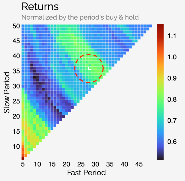
Let’s take Apple as an example. Here’s the map we get:

This map shows us that, depending on the combination of fast and slow EMA lengths (X and Y axis respectively), our strategy would deliver between approximately 0.45x to 1.05x the return of simply buying and holding Apple over the same period.
At first glance, that might not seem like much — but here’s a useful rule of thumb: For stocks that have been in a strong uptrend during the backtest period (like Apple), you should expect strategy returns to be close to 1 at best. Why? Because when a stock moves mostly upward, it becomes extremely difficult to beat a buy-and-hold approach. In other words, there isn’t much to protect against. But that doesn’t mean running a strategy isn’t worthwhile. Even if it doesn’t dramatically outperform buy-and-hold, it can still act as a form of insurance — especially if the stock hits a rougher patch in the future. It can offer more timely exits, better drawdown control, or reduced exposure during downtrends.
Now let’s look at a different kind of stock — one that has seen a substantial downtrend. Here’s what we see for FUBO:

As you can see, strategy returns in cases like this can far exceed buy-and-hold (up to 11.5 for a two-EMA strategy), since holding through a prolonged decline can be severely damaging. For example, the configuration highlighted in white (Fast EMA = 8, Slow EMA = 17) produced a strategy return of +56% over the backtest period, while buy-and-hold delivered -86%. This results in a performance metric of 11.25 — showing just how much value a good tactical strategy can add in downtrending markets.
Back to our Apple example: let’s pick a random point in the upper green-yellow zone of the map:
Clicking on that point (which, in this case, corresponds to a fast EMA of 29 and a slow EMA of 36 will display the performance statistics for that specific configuration.

In this case, the configuration yields a normalized return (our metric) of 0.81, with a hit rate of 57.1%. We also observe that the strategy executed only 7 trades over the reference period — indicating relatively low activity. Other relevant statistics include the average win and loss, their ratio, the number of days the strategy stayed in the market, and the duration of the corresponding buy-and-hold period (which isn’t totally constant — more on that later).
One particularly interesting observation here is that the strategy’s maximum drawdown is only about one-third of the drawdown seen in the buy-and-hold approach for Apple over the same period. Even when a strategy underperforms on a raw return basis, this kind of risk reduction can be extremely valuable. A -31% drawdown may seem manageable when looking at a chart, but it’s a very different experience when real money is involved. In practice, many investors would have struggled to hold through such a decline — making the buy-and-hold return somewhat illusory.
Finally, an underrated metric is the ratio of average win to median win. One common issue in backtesting is that not all rallies (or drops) are equal. Take, for example, Tesla’s explosive rally from summer 2020 to 2021: a strategy that perfectly captured that one move — even if average elsewhere — would still show strong results. In such cases, the average win is inflated by the outlier run and can vastly exceed the median win. A high ratio here can be a sign that a strategy’s edge depends heavily on a few exceptional trades.
When you click on a data point in the return graph, the corresponding point will also be highlighted across the other charts, making it easier to analyze the full performance context.

These graphs display key metrics such as the number of trades, maximum drawdown, hit rate, average win vs. median win ratio, average loss, and the average win-to-loss ratio. All of these can help you identify the optimal strategy for your personal investing style.
For example, I tend to avoid strategies that involve frequent trading, as I know I’m not the most consistent trader and lean more toward a long-term “hodler” mindset. That’s why the zone I gravitate toward might not be ideal for everyone. Other investors who are more risk-averse might prioritize strategies with the smallest maximum drawdown. It all comes down to personal preference.
You can then visualize your strategy in the chart section of Tunemap. In this specific example, the chart from 2024 to today shows only a few trades—not all perfect, but still effective at protecting gains.

Other technical indicators
The example we just covered used a two-EMA crossover strategy, but TuneMap can also optimize the configuration of other well-known indicators. As of this writing, you can also fine-tune the buy and sell thresholds for a Relative Strength Index (RSI) strategy, as well as the fast and signal periods of a classical MACD and two other WU proprietary signals.
Now, while the conventional MACD actually involves three parameters—fast period, slow period, and signal period—we’ve simplified this to a two-dimensional optimization problem to avoid the hassle of visualizing results in 3D space. To do that, we constrain the slow period using the relation:
Slow period = 2 × Fast period + 2
This relationship wasn’t pulled out of thin air. Not only does it reproduce the standard MACD settings (12, 26, 9), but our tests across 3D optimization spaces confirmed that this relation often leads to optimal results.
In addition to these three classical indicators—each backed by academic research—we’ve added two proprietary tools from WealthUmbrella.
The first is our Phase Angle. If you’re unfamiliar with it, this was one of the first indicators developed at WU, specifically tailored to capture momentum. Behind its trigonometric formula lies an attempt to fix a common drawback of two-EMA strategies. The issue? After a strong uptrend, the fast and slow EMAs can drift far apart, which delays their ability to detect a reversal. On the flip side, in a sideways market, the EMAs often sit close together and may cross repeatedly, triggering unnecessary trades.
Phase Angle removes this dependency on distance. It looks only at the angle of the momentum vector along the curve, essentially filtering out the noise caused by the spacing between EMAs.

If the market is calm and moving sideways, the angle remains small, so the Phase Angle doesn’t spike. But if there’s a sharp downturn—even from an all-time high where the EMAs are far apart—the Phase Angle spikes immediately.
This indicator plays a key role in hedge strategies during bear markets, and now you can customize its threshold for each specific stock. For example, by running TuneMap on TQQQ, you can design your own hedge strategy. Choosing the configuration with a strong historical return might yield something like this:

A robust strategy that stays patient during uptrends, yet steps aside during the worst downturns.
The last indicator we’ve added is the MACD+—our attempt to fix three well-known limitations of the traditional MACD. What started as a refinement quickly turned into something much more powerful. We were genuinely impressed by the results: in many cases, MACD+ doesn’t just improve on the classic version—it outperforms a wide range of standard technical strategies altogether. We’ve written a full post detailing what we changed, why those changes matter, and how to use MACD+ effectively in TuneMap, since it introduces a few additional parameters. You can find that post here.
Back(test) to the future
You may have already noticed one large map called the Simulation Filter that I haven’t talked about yet. I saved this one for later because, despite its simple appearance, it carries a lot of weight. When building a serious investment strategy, one of the first things we need to acknowledge is that a stock’s historical price trajectory has been shaped by a series of unique, often unrepeatable events. These events define the past—but they won’t necessarily define the future. That’s where the problem lies: many backtests unintentionally favor strategies that just happened to perform well during specific, sometimes extreme episodes in a stock’s history. The Simulation Filter is designed to help mitigate that bias.
Take CrowdStrike in the summer of 2024. Its stock lost half its value in just a few days after it was revealed that a massive global internet outage had been caused by a flaw in its flagship product. This is clearly an extreme case—but it illustrates a broader point: every stock has its own distinct history, shaped by a sequence of events that will never repeat. Whether it’s regulatory setbacks, product failures, surprise earnings, or acquisitions, these one-off events can distort a backtest. Strategies that “fit” those unique moments may look great in hindsight—but that doesn’t mean they’ll hold up going forward. In fact, the only thing we can say with 100% certainty about a stock’s future trajectory is that it won’t be identical to its past — and that’s the core challenge when it comes to designing a strategy. To address this, we need a way to test strategies not just on what happened, but on what could happen.
That’s where volatility modeling—and specifically, GARCH—comes in. GARCH stands for Generalized Autoregressive Conditional Heteroskedasticity, a statistical model used to estimate how volatility evolves over time. Unlike models that assume volatility is constant or random, GARCH captures the fact that volatility tends to cluster—calm periods follow calm periods, and turbulence often leads to more turbulence.
We use a more advanced variant called Glosten, Jagannathan, and Runkle Generalized Autoregressive Conditional Heteroskedasticity (GJR-GARCH—be certain I’ll never pronounce that full name in a webinar. Never…), which goes a step further by capturing a key market reality: negative shocks—like bad news or earnings misses—tend to trigger sharper spikes in volatility than positive shocks of similar magnitude. This asymmetry aligns much more closely with how markets actually behave and gives us a more realistic way to model how a stock reacts under stress.
Here's how we use it: for each stock, we build a GJR-GARCH model to estimate how it responds to changing volatility. Then, we use that model to run a Monte Carlo-style simulation of 1,000 possible future price trajectories. Each of these 5 years price trajectory have about the same overall realized volatility than the original one. These simulations help us evaluate how a strategy might perform across a wide range of plausible futures—not just the specific historical path we happened to live through. This include Bull scenario or very bearish one, or more regular one.
TradingView’s strategy tester, while popular and easy to use, does lack Monte Carlo simulation or any form of probabilistic stress testing—tools that are essential in serious strategy design. Without them, it becomes difficult to evaluate the robustness of a strategy beyond the single historical path it was trained on, leaving it vulnerable to randomness and regime shifts in real-world markets.
This approach helps us answer the most important question: is the strategy truly robust, or is it just overfitted to a handful of one-time events? Using GARCH modeling—especially GJR-GARCH—is a key part of building strategies we can actually trust. It’s how we move beyond hindsight and toward something capable of navigating an uncertain future.
Below is an example using Google (GOOG), showing the historical heatmap for a 2-EMA crossing strategy, alongside the averaged heatmap generated from the 1,000 simulated GJR-GARCH trajectories.

You won’t be able to directly view the heatmap generated from the GARCH simulations, as we found it can sometimes be difficult to interpret and apply effectively. Instead, we’ve designed a filter based on that simulated map, which we apply directly to the original historical strategy return heatmap. This filter highlights the regions that appear promising both in historical data and across a wide range of hypothetical futures. At the same time, it helps downplay areas of strength that are likely the result of isolated historical events—those that may have disproportionately shaped a strategy’s performance, but are unlikely to repeat. Here’s what we get for our Google example: the GARCH-filtered heatmap for a 2-EMA crossing strategy, showing the regions that appear robust across both historical data and simulated futures.

The Future-Weighted Return Map now clearly shows that the middle zone offers a better configuration than the upper right. So, in short: while it might be tempting to jump straight to the point of maximum historical return on the original heatmap, selecting the point with the highest return on the Simulation Filter is, in theory, more likely to lead to better results going forward.
Let’s wrap up this section by revisiting the Apple (AAPL) example. You may have wondered why I didn’t just select the point with the highest return. The reason is simple: the Simulation Filter suggests that the point I chose is likely closer to the true optimal configuration—if we give weight to what could happen in the future, rather than just what worked in the past.

Historical Period Used
The period we used to evaluate the performance of different strategies spans from May 1st, 2020 to January 1st, 2025.
Why dedicate an entire section to something that could be answered in one sentence? Because choosing a backtesting period is actually quite tricky—and understanding our reasoning behind this choice can help you recognize some of the pitfalls of backtesting. If you’re not interested in those details, all you need to know is that this period is an excellent choice. Otherwise, read on for some important considerations.
The goal of backtesting is to use past stock behavior to develop a model that we hope will perform well in the future. This leads to two key constraints when choosing a time period:
The period must be long enough to reflect how the stock behaves across different market conditions.
The period should reflect how the stock behaves in the current context—its business model, investor base, and environment.
Indeed, markets go through various phases: strong bull runs, regular or euphoric bull markets, sharp corrections, slow declines, long bearish stretches, and slow bleeding periods. A good backtesting window should include a diverse mix of these market types to ensure the strategy performs robustly across them. For example, we don’t want a strategy that excels during downturns but consistently fails to participate in bullish recoveries.
That would lead us to favor a very long time frame… but here comes the second constraint: For example, is Tesla’s price action in 2018—when it was a heavily shorted company teetering on bankruptcy—really representative of its behavior since 2020, during the EV boom? Probably not. Going too far back in time risks capturing price behavior that is no longer relevant, given how dramatically some companies have evolved. That’s why we aim for a period that’s long enough to capture various market types, but recent enough to stay contextually meaningful.
Now, why do we believe this particular period is so strong?
Because the last five years have been incredibly rich in market diversity. We saw:
A post-COVID rally where everything soared on tweets and SPAC mania
A deep, multi-wave, year-long bear market (2022)
A bull market that was uneven—large caps soared while mid-caps lagged
Numerous pullbacks of varying intensity
A sharp spike in volatility in the last six months of 2024
This variety provides a realistic and challenging environment for any strategy—arguably as close to an ideal testing ground as one could hope for.
One last point: you might have noticed that we started the period just after the COVID crash.
Why? Because while it’s tempting to include a historic event like the COVID crash in a backtest, doing so introduces serious distortion.The crash was extremely fast and deep—a nearly 40% drop in under a month. Any strategy that exits and re-enters quickly during that event would show unrealistically strong performance, overshadowing the rest of the strategy’s behavior across the backtesting window. And while it’s important for strategies to perform well in crashes, events like COVID are rare—perhaps once in a century. Including such an outlier could give a misleading picture of performance consistency.
That said, the post-COVID period offered us a unique opportunity: starting on May 1st, 2020, when most stocks were already trending upward. This context allowed us to quickly generate trade strategies for nearly every metric configuration across almost every stock—maximizing the length and richness of the test period.
Now, this brings us to a surprisingly complex topic: how and when we calculate Buy and Hold returns. It may sound simple, but in practice, it’s anything but. Internally, we’ve spent countless hours debating and testing different approaches. The truth is, the way you define Buy and Hold can dramatically reshape your strategy performance map—it can blur the signal, or, if done right, make it much clearer.
Here’s what we decided: we start the Buy and Hold period at the first trade signal of the strategy. Even if that signal is an exit, it still reflects a decision by the strategy to engage with the market, and perhaps (right or wrong) choose to remain on the sidelines for a time.
For the end of the period, we apply a similar logic. We stop tracking returns—both for the strategy and for Buy and Hold—at the last signal generated by the strategy before January 1st, 2025, whether that signal is an exit or an entry. Closing on an exit signal is straightforward: the strategy is stepping out of the market, so we stop measuring returns from that point. But why also stop on an entry signal, instead of simply stopping on the previous exit if it’s the final signal in the period? Again, it comes down to consistency with our earlier reasoning: when the strategy exits a trade, it’s making a deliberate decision to be out of the market. If it turns out to be correct, this improves its performance versus Buy and Hold; if not, it penalizes the strategy. Either way, it reflects a complete, intentional trade. So when an entry is the last signal before our cut-off, we treat it as the final decision and end the evaluation there—rather than artificially closing an open trade on a predetermined date, which would distort performance.
What we want to avoid is exactly this: closing an open position on an arbitrary date—like January 1st, 2025—just because it marks the end of our test window. Doing so would introduce artificial profits or losses that aren’t the result of any real strategic decision, and that can seriously distort the evaluation of a strategy’s true performance.
Now, this might sound like a theoretical or philosophical debate—but believe me, we’ve tested every possible variation. And when it comes to the 1,000 five-year GARCH trajectories, the impact is dramatic. A bad assumption here won’t just slightly skew results—it will blur the entire map and render your insights unreliable.
Because of this, total Buy and Hold return can vary slightly across different configurations, depending on when the first and last trade occurs. But in the end, what truly matters isn’t the absolute return—it’s how the strategy performs relative to Buy and Hold. So even if there’s a small variation in the Buy and Hold duration, it doesn’t really matter, as long as it matches the timeline of the strategy itself. Using this framework gives us the clearest, most meaningful view of a strategy’s real-world performance.
Conclusion
It’s hard to present TuneMap in an overly simplified way—because, no matter how we try, strategy optimization just isn’t a simple topic. If you’ve never done it before, you might not digest everything in this post in a single sitting. And that’s perfectly okay.
That said, I think we’ve done a pretty good job of making TuneMap as simple and intuitive as possible. It requires no coding, and the results are pre-computed for every possible parameter configuration of the supported indicators. All you need to do is pick a point on a graph, review the stats, and decide whether that strategy fits your investing style—and whether you’re comfortable with the trade-offs. Once you are, you can implement it directly in TradingView and set up alerts (see my post on MACD+ for a how-to) that notify you when your personalized strategy triggers.
Chances are, once you become more familiar with the tool, coming back to this post will reveal new layers—because you’ll already understand the foundation of strategy building.
This is probably the part of our new WU Advanced subscription that I’m most proud of (along with the Downtrend Exhaustion Dashboard). Partly because it wasn’t easy to build—but more importantly, because I truly believe this is something that can make a difference for retail investors. Institutional investors already do this kind of work all the time. Having a clear strategy when it comes to holding individual stocks is crucial—and now retail investors have a practical and easy way to do the same.
We know the current number of indicators in TuneMap is still limited. This is our minimum viable product, and we plan to build a lot more on top of it. We’re already exploring features like stress testing strategies under extreme historical conditions—think epic drawdowns or long, grinding bear markets. Some of our GARCH-based simulations already include these scenarios, but we’d love to create a mode that isolates just those environments.
We also plan to add more technical indicators, and possibly let you combine multiple signals. On the user experience side, we’re considering more basic but useful features, like the ability to save your favorite configurations for easy access.
But I’ll say this: after personally using TuneMap over the past few weeks, the tool has already proven invaluable. For every position I’ve taken recently—thanks to our Retail Momentum Screener and Stock Health Dashboard—I’ve only chosen to hold when the TuneMap-optimized strategy looked compelling. I’ve been using those entry points as my signals, and so far, the results have been excellent.
In fact, I think it’s already rekindled my interest in investing in individual stocks. It’s not that I had stopped altogether, but as I came to trust our broader market signals more and more, I tended to lean toward leveraged market ETFs a bit more. After all, market investing is a bit easier—major indexes tend to eventually recover. But now, I’m much more confident that I have a personalized way to avoid riding individual stocks all the way down when things turn.
Every investor has their home runs—and their busts. On the bust side, I bought Teladoc in 2021… right at the top. I didn’t hold it all the way to the bottom, but I definitely stayed in the trade far too long. I’m confident that with TuneMap, that kind of mistake is one I won’t repeat.
I hope you enjoy using it as much as I do. I know the learning curve can feel a bit steep at first, and for that reason, once I’m back from my honeymoon, we’ll be hosting a webinar to walk through how it works in a more interactive way.


Hi Vincent and Team,
v. impressive work, thanks.
Appreciate help on following:
1- RSI setting: is a trading view rsi indicator the team prefers esp to set up the alerts and esp if the alert can be set up either for crossing the upper or lower band instead of setting one for each , do you all plan on releasing one of your own , what lenght for RSI to use (i am assuming 14 (on daily) is the convention
2- for the available tune map indicators, b/w returns and simulation a lot of times their is great synchrony so not an issue in that case, but if there is discordance b/w the 2 heat maps than to give preference…
Follow up from the webinar on why the B&H period (and return) change in TuneMap. Here was an answer I gave, deep into a comment: The long answer can be found in the section Bob pointed out. But to summarize:
Each combination of parameters naturally produces its own distinct sequence of buy and sell signals. To accurately evaluate a strategy, we must measure its performance starting and ending on those exact signal points. Using a fixed time frame across all strategies would severely distort the results.
For example, many slow selling strategies showed open trades still in profit when our backtest period ended on January 1st, 2025. But if those same trades had been held until the bottom of the tariff-induced…
I asked ChatGPT for some Bitcoin/Crypto related ETF suggestions. Most don't look good on the MACD+, but these two have pretty good Returns/Simulation map alignment I think, and decent Hysteresis Returns, Hit Rate, etc.
I haven't pondered the statistics or fundamentals. I'm not recommending them -- just saying they look interesting.
Best Hysteresis Returns I've seen. I'm not greedy. I'd be fine with just half those returns. 😎
PS. I'm not recommending these settings -- they just look interesting.
What do the numbers on the right beside the simulation filter indicate (the scale in this case of 0.00 to a little higher than 0.3)?