
The Market Breadth Rework

On Thursday, Vincent sent an update explaining why some of you may have seen a WU Out on the Hedging Signal in TradingView and why it was NOT a valid signal. In the blog post, Vincent explained that during our rework of the Market Breadth indicator we discovered that one dataset inside the indicator has started misbehaving. If you have not read it already, you may start there as it gives some insight on why the work we did here matters. For the rest, this blog post is the full story so let's jump in!
As soon as our Bear Mode Rework post went up, we started on the bull side of the strategy. A quick word on why we went in that order. The two sides take turns. Once a bear market is declared, Bear Mode takes the wheel, and the bull-side indicators stop driving the position. So by fixing Bear Mode first, we could judge the bull side only on the periods it is actually in charge of. We could ignore the stretches inside bear markets, where its signals are at their noisiest and matter the least. That let us tune it properly for where it counts.
The bull side is built from around 20 datasets, but there is one indicator that stands out as it is highly correlated with major drawdowns. The plan was to cover the whole bull side in one post. We decided to go deeper on the core indicator alone instead, because everything that comes after depends on it.
That indicator is our Market Breadth indicator, formerly known as the Hedge Signal Risk Dataset on TradingView. This post explains why breadth matters so much and what we changed, and gives you enough to understand how it works and trust it. The post after this one should come faster and will cover the fully cleaned Hedging Signal. This will leave us with the final and most awaited piece of the rework: the new additions. I hope we will be able to deliver those by the end of October, but as it involve exploring new data, its always harder to estimate the time it takes properly.
What breadth measures and how it thinks
There are many ways to measure market breadth, but they all ask the same question: how many companies are taking part in the current trend? In other words, how are all the companies in the market doing, big or small?
This matters because the index is driven by the mega-caps, and the AI run-up has made them weigh even more. The top 10 stocks in the S&P 500 are only 2% of its companies, yet they hold between 35 and 40% of its total market cap. Think of a class where a few top students pull the average up: the average looks fine even when most of the class is struggling. In the same way, a good run from those ten stocks can hide a great deal of pain everywhere else. But when enough companies feel that pain at the same time, it eventually reaches the market as a whole.

To see why a real crash practically always comes with breadth, it helps to separate two kinds of declines.
The first is a rotation. Money moves from one corner of the market to another. If the corner being sold happens to be the one carrying the index, the index dips. But the average stock is fine, hedge funds are not reaching for protection, and someone holding a diversified portfolio barely feels it. July 2024 is a clean example: the S&P 500 fell nearly 9% while our breadth reading sat at zero.
The second kind is a real crash. The selling is everywhere at once and there is nowhere to hide. That is exactly what breadth measures. The deeper the decline, the higher the reading climbs. You cannot get a 2008 or a 2022 without the average stock going through it.

Timing tells the same story. Sometimes breadth is already flashing while the index still sits near its high. That means the average stock has already rolled over, and the index is being held up by a handful of names that money has crowded into. That is a fragile place to be.
The earlier the signal fires relative to the top, the more likely the decline ahead is a serious one. Twice in the record, in 2007 and in 2021, the indicator was out before the market had even topped. Those turned out to be the two longest bear markets of the last 25 years, and two of the three deepest.
This is why we believe our breadth indicator might never miss a big drawdown. We say "might" because, in theory, there is a way. If the top 10 stocks each lost 55 to 60% while everything else stayed flat, the index could fall more than 20% without breadth ever getting worse. That is very unlikely. These are not speculative assets. They are real companies doing real business with real partners. If they lose that much value, the ripples reach their customers and suppliers, fear spreads, and the indicator moves.
Claudia Sahm's recession indicator works the same way. It can trigger false alarms, but it might never miss a real recession. The reason is that a recession always starts with rising unemployment, and rising unemployment is exactly what it measures. Again, "might". In theory, a recession could arrive without unemployment rising, for example if firms cut hours instead of jobs, or if workers leave the labour force fast enough to keep the rate flat. In practice, a real recession means real businesses losing real revenue, and layoffs usually follow.
Has it ever missed?
So you don't have to take our word for it, we pulled some statistics on the indicator. Here is the main one. The second part of this post, where we get into the technical details, develops it further.
The chart below shows every S&P 500 decline of 5% or more since 2001. There are 32 of them, one dot each. Left to right is how high the breadth reading climbed during the decline, with the exit line at 100. Top to bottom is how far the market fell. A filled dot means the indicator sent us out during that decline. A hollow dot means it stayed quiet. The shaded corner is the one that matters. A dot in that corner would be a deep decline that the reading never flagged.

Nothing has ever landed there. Every decline past 20% was flagged. So were six of the seven past 15%. And the dots line up: the deeper the fall, the higher the reading went. There are two hollow dots past 10%. They deserve a plain description, because they have something in common: both were mechanical shocks, not economic ones.
The first is early February 2018. The index slipped just past -10% and was back in thirteen trading days. The trigger was a one-day spike in volatility that blew up a handful of products betting on calm markets. It was an accident in the market's plumbing, not a problem in the economy, and it was over almost before anyone outside a trading desk noticed.
The second is the spring of 2010, and it deserves the longer telling. The backdrop was Greece. Its debt crisis had been building since the winter. By late April, with the index at its high, the question had become whether the crisis would spread to the rest of Europe.
Two weeks into the decline, the flash crash landed on top of it. On May 6, the market dropped close to 10% and recovered, all inside one afternoon. Thousands of trades were cancelled after the close, and nobody could say why it had happened. Algorithmic trading had grown quietly for years, and this was the first time the public saw it misbehave that much. The regulators' report only came out at the end of September, nearly five months later. In the meantime, every headline out of Europe was landing on a market that no longer fully trusted its own plumbing.
The chart shows what that fear produced. The index spent most of the summer between 7% and 13% below its high. It did touch a low of -16%, but only briefly: six sessions to go from -12% down to the low and back up to -13%. Across the whole summer, the index closed below -13% on a handful of days. By November the high was reclaimed, and the year closed up 13%.

Through all of it, our reading peaked at 58. That is closer to the line than it sounds. The reading is not a scale from 0 to 100; 100 is simply where the exit line sits. In fact, the reading spends most of its life below zero. In the last week of April it stood at -297, within five points of the lowest reading in the entire record. From there it climbed more than 350 points in ten weeks and stopped at 58. That is higher than 87% of all days, but short of the line. The average stock was under real pressure. It just never broke the way it does when a real bear market is starting.
That is the limit of this indicator, and we think it is the right one. Breadth measures how the average stock is behaving, not how the index is behaving. Some shocks come from the market's machinery, or from a fear that never quite turns into a global economic event. Those can push the index down 10 or 15% without the average stock giving way. Declines like that recover on their own. The declines that do lasting damage are the ones where the average stock is going through it too, and breadth has never missed one of those.
What the rework did
Our goal going in was simple: make the indicator perform better. We had two targets in mind, faster re-entries and fewer false alarms, because those were the weakest links.
The exit side was not in question. Vincent had originally tuned the indicator to trigger early in a major drawdown, and it does that job well. What we did not know was whether we could improve the other two without giving some of that back. So early exits on the big declines were a hard rule from day one. Nothing we tried was allowed to break it.
We started with the false alarms. Digging into them, we found something. The original indicator relies on two series, and one of them has slowly drifted upward over the years. The second part of this post goes into the details. The short version: this series now prints slightly higher values on average than it did when the thresholds were set. So the thresholds is easier to reach today than it used to be. Picture a high-jump bar that was set years ago. The bar has not moved, but the ground under the jumper has slowly risen, so the bar is slightly easier to clear.
The drift cut both ways. On the plus side, it gave a faster exit in the 2025 correction even though, in the full strategy, another indicator had already taken us out by then making that gain on paper only. On the minus side, it produced three exit we could classify as false alarms between 2024 and 2026.

A data-driven strategy will always have close calls like those. Sooner or later, a signal lands on the wrong side of the statistics. The obvious fix would have been to raise the thresholds. But that slows the exits on the major declines, which is the one thing we were not willing to trade. So we tried other ideas. We tried normalizing the series. We went through every dataset available to us. In the end, we landed on a reworked version of the other original series, the one that had not drifted.
With that series retuned, here is what we got:
- Exits on the same day, or a few days later at most.
- Re-entries that are slightly faster on average.
- A worst drawdown, for this indicator alone trading the S&P 500, that moved from 18.4% to 17.4%.
- 10 exits since the start of the dataset instead of 16. The 3 false alarms are gone, and several back-to-back exits merged into a single longer one.
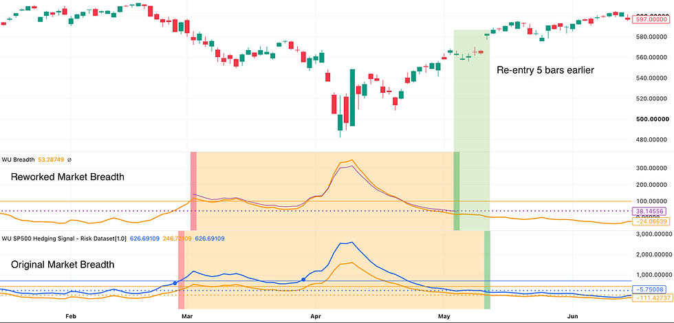
Here is what changed on the chart. The same series is now prepared in two different ways: one to decide exits, the other to decide re-entries. So the indicator shows two lines. The orange line handles the exit. When it climbs above 100, we are out. At that point a second line, the purple one, becomes visible and takes over. It has to fall below 40 to trigger a re-entry. Two lines, but one dataset behind both, where the original had two.

The main thing we got out of it is slightly better performance with fewer moving parts. Some will recognize the theme from the Bear Mode Rework. Fewer moving parts make the indicator more robust and lower the risk of overfitting.
The updated Market Breadth indicator will be released on TradingView shortly after this post. Until the rest of the bull side is reworked, it runs alongside the original. In practice, when the original calls an exit, the new one has to confirm it before we act. There is no reason to hold back a better tool while the rest is being finished.
From this point on, we get into the technical details that support the work. If that is not your thing, feel free to stop here. There are no new conclusions below, only the evidence behind the ones above. For those interested, let's dive in.
Technical Deep Dive
Part one made a set of claims about this indicator and gave the numbers that support them. This part shows the work behind those numbers. Each section takes one question we had to settle during the rework and lays out the evidence for you to see. Read together, they explain why the indicator ended up the way it did.
Does it ever miss?
We grade every rule in the strategy by the one mistake it cannot afford. For this indicator, that mistake is missing a major decline. It must never happen. In every test we ran, doing better on smaller dips was a bonus, but we were ready to give some of that up if it protected the main rule. So before getting into what we changed, we start with the record of the exit on its own.
A word on how it is scored. The first half of this section only measures the exit triggered by market breadth alone. The re-entry is a different problem and gets its own section further down.
Every fall of 5% or more from a rolling one-year high counts as one episode. An episode runs from the high until that high is recovered. So the 2009 lows belong to the decline that began in October 2007, and the 2022 lows to the one that began in January 2022. The 2000 to 2003 crash is not included, because the dataset only starts in mid-2001, when that crash was already halfway through. That leaves the 32 declines from part one. The indicator flagged all three past 20%, six of the seven past 15%, and eight of the ten past 10%.
Thirty-two is a small number to hang a claim on. So the chart below looks at it on a day by day basis instead. It takes every single day, looks how far it is from its one year high and checks if the Market Breadth indicator already flagged an exit in between. One mark per trading day and one row per year since 2004. The colours read as follows:
- Blue: the index was more than 10% below its one-year high, and the signal had already fired earlier in that decline.
- Red: the index was more than 10% below its one-year high, and the signal had not fired.
- Light gray: the index was within 10% of its one-year high.

Two things stand out. First, every decline past 20% was caught, and more importantly, caught before the -10% mark. If it had been caught later, we would see red at the start of each major event for the days before the trigger. Second, every red mark belongs either to the 2010 episode covered in part one, or to the two days in 2018 that barely went past -10%. There is no third miss hiding in the daily data.
The next question is how early the indicator detects those major events. The chart below shows how much of each decline was still ahead when the signal left. Each bar has two parts. The orange part is how far the index had already fallen from its latest peak on the day of the trigger. On average, the exit comes 6.5% below the top, with a median of 5.6%. The blue part is how much drawdown was still ahead at the exit. The average is 15%, pulled up by the big crashes. The median lands at 10.8%.

Why did we get three false alarms?
We have now settled that this indicator is highly correlated with major drawdowns. The other side of the coin is the false alarms: how many of the exits it triggered turned out to be unnecessary? The previous chart shows a few narrow exits that did not have much drawdown left after the trigger. This is the unavoidable cost of a data-driven strategy. Even with the strongest statistics, an event will eventually land on the wrong side.
First, a quick recap on the original indicator. As some may remember, it tracked the same measurement twice: the same statistic from two providers, each with its own coverage. They are the blue and orange lines in the TradingView indicator. Let's call them Series A and Series B.
When we reviewed the trade list, one pattern stood out. Before 2021, Series A fired every exit with Series B following on the same day or at most a few days later. Since 2021, the dynamic shifted with Series B firing every exit and Series A following shortly after.
To compare the two series, we divided B's readings by A's. From 2008 to 2021, that ratio averaged 1.4. Since 2022 it has run near 2, between 1.9 and 2.3 in each of the last four years. Why? The number of companies in B's coverage rose about 55% between 2019 and 2022, almost all of it in the 2021 listing wave. B's readings rose along with that count. A fixed threshold on a series that has grown is, in effect, a lower threshold, and an easier one to reach.

One final thing to note. The market is more concentrated than usual because of the AI trade. In that kind of market, it is to be expected that the average stock does worse than it would in a broader bull market. Combined with the 2021 listing frenzy, we already expected a higher read on both lines. That alone could have explained the higher readings, and Series A does read higher since 2022 as well, but not by nearly as much as Series B. So our best explanation for the gap is coverage, not the market. Both Series are computed on different subset of the market, although we have no way to know exactly what except from the very brief three words title. We contacted TradingView for more information and were faced with a rejection to our request.
The natural rescue would be to correct B for its own scale and keep its speed. The ideal correction would divide by the exact number of companies in the computation, but that number is not given to us. We have found a way to generate a count and it did seem to apply a good correcting lens on the dataset, but since we could not in anyway confirm how both metrics were computed, we could not guarantee the correcting lens would still work 5 years out. We thus decided to remain on the cautious side and NOT use it going forward.
Vincent has had this idea in mind for some time without the means to do it. It is an argument for branching out of TradingView and computing our own version of this indicator, where we control every parameter and can be certain that both measure the exact same thing. This might come somewhere in the future as we do believe that there are opportunities outside of TradingView to fetch alternative datasets and leverage the fine tuning opportunities that comes with managing the full process. However, that would require assuming that there is two distinct versions of the algorithm. Combined with the fact that data is expensive, we are not there yet and try to make both version as close as possible (even if that's never going to be perfect) in order to keep things less confusing.
In the meantime, we tried other ways to normalize it, for example against a baseline of its own recent history. None of them removed the false alarms while keeping the speed. In other words, B's head start seemed to simply come from luck, not skill. We thus took the decision to remove Series B from the indicator.
Why not change the series?
This indicator is a cornerstone of our strategy, so we went as far as reconsidering the very datasets it leans on. Market breadth can be measured in many ways, and TradingView offers a wide selection of series. We extracted over 20 of them and split them into four families, based on the idea behind the number.
We then tested how correlated each one was with major drawdowns. We also added a safeguard. For a dataset to be selected, at least one other dataset from the same family had to confirm the correlation. If one series looked good and a supposedly near-identical series did not, that was enough to remove it.
The result was clear. No other dataset offered the same correlation, confirmed by its neighbours, as the one Vincent had already selected in his original work.
Why not just raise the line?
With the dataset chosen, we ran the same rule at every exit level from 40 to 200 and watched three things:
- how many declines past 10% it caught,
- how far below the peak it typically sold,
- how many false alarms it raised each year.

Every step up is paid for in exit price. At the 100 exit threshold we ship, the rule sells about 5.8% below the peak on the eight declines past 10% that it catches. Raise the line to 120 and that becomes 8.0%. Nearly double it to 180 and it is 10.3%.
What a higher line is supposed to buy is fewer false alarms, but the bottom panel shows there is nothing left to buy: above 100, the false alarms are already as low as they go.
The other direction shows what catching 2010 would cost. To catch it, the line has to drop below 60 on the top panel, and at that level false alarms run six times higher. That is not a price worth paying, as every false alarm erodes trust in the strategy.
So what did change?
The re-entry is the biggest part of the rework. Let's start with how we told a good re-entry from a bad one.
Obviously, a good re-entry captures as much of the upside since the exit as possible. But if we optimized on that alone, we would not get an indicator we would be happy to use. It rewards re-entering as fast as possible to catch the bottom of each move, and the price for that is getting caught in the next leg down on some trades. So we needed a second criterion.
We defined a bad re-entry as one followed by a drop of 10% or more within the next month. A rule with even one of those was rejected outright, whatever its overall performance. A drop between 5% and 10% did not reject the rule, but it counted against it when we compared the candidates.
We explored different tunings of the same dataset and landed on a different approach from the original. The original indicator, which is still the one used for the exit, compares how many stocks are doing badly with how many are doing well. That comparison helps keep false alarms down. In a real major drawdown, very few stocks do well. In a routine sector rotation, the stocks doing well offset those doing badly.
At the end of a correction, though, the question is different. What matters is whether the stocks doing badly have finally stopped. Waiting for them to start doing well again adds delay, because the recovery has to run further before it is detected.
May 2025 is a good case of this. The new rule re-entered on May 5, 2025. The original was back in on May 12, five days later and about 3.5% higher. The new rule does not keep all of that 3.5%, though. Back in March it had exited two days later than the original, and that gave most of the advantage back. Net, the gain on the trade moves from 1.9% to 2.3%, not more. The chart below shows the two side by side, with the days each rule was out shaded.
Across the record, the breadth rule had seven re-entries to make. (In the three bear markets, the re-entry was handed to Bear Mode, so those are not counted here.) The reworked rule was back first on five of the seven:
- October 21, 2011, against October 24.
- A day earlier after the January 2016 exit.
- January 16, 2019, against January 24.
- A day earlier after the October 2023 exit.
- May 5, 2025, against May 12.
It was later on two: by four days after the October 2014 exit, and by one day after the August 2015 one.
On average, that is about a day earlier. That is the whole of "slightly faster on average", and we do not claim more. The bigger story is where the new rule holds. In 2007, it was out on August 3 and still out when the real decline began in October. The original came back in on September 19, having lost nearly 5% on the round trip, and left again in November.

Here is the full tally against the live rule. The reworked rule is better on four. All four are false alarms sidestepped: August 2007 and the three of 2024 to 2026. It is worse on one: October 2023. Both rules left there, and both lost on the trade. The new rule left four days later and lost 5.8%, against 2.4% for the original. The original's earlier exit there was series B's doing. With a single series, that lag is the price.
On every other decline, the two rules score the same. On the ten declines both traded, the exit came on the same day six times, two to four days later four times, and never earlier. Sixteen exits become ten. Here is how:
- The three false alarms are gone.
- August and November 2007 merge into one exit.
- The 2021 to 2022 sequence merges into one.
- A five-day exit in April 2020, fired on the first day after Bear Mode handed back control, is not made at all.
The worst drawdown moves from 18.4% to 17.4%. Five parameters become four. The scorecard below lists every episode where the two rules differ, and the totals across the record.

Did we fit it to the crashes we know?
The objection is fair. Twenty-five years contain only a handful of real crashes, and the line was chosen with all of them in view.
Some of you may remember this topic from the Bear Mode Rework post. The usual protection against overfitting is a holdout period: you set aside part of the history, tune on the rest, then test on the part you set aside. In this case, we still believe it is not the best tool. With so few events, a holdout would be too small to confirm or deny anything. It would be for show at best, and it would cost us one of the few events we have to tune on.
This time we used another method, one that is also used to train AI systems when huge datasets are not available. It is called K-fold, and the idea is simple:
1. Tune (or train) the algorithm on the full dataset once.
2. Remove a few events and re-tune on the slightly smaller dataset.
3. Do it again with a different set of events removed. And again, and again.
If every tuning ends up in the same region, you gain confidence that the solution is not tailored to specific events, and so is not overfitted. In our case, we removed a crash and a buffer around it, re-ran the whole selection on the history that remained, and looked at where the line landed:
- Without 2008 and 2011, the rule picks 102.
- Without 2020, 2015 and late 2018, it picks 98.
- Without 2022 and 2023, it picks 100.
- Without 2016 and 2025, it picks 97.
Every refit lands within about 3% of the shipped 100. No single crash is holding the number up.

There is one exception worth mentioning. With 2020, August 2015 and late 2018 removed, a second option tied with the 98: a line at 91. That tuning exits faster and re-enters faster. It gives the same returns, but with more drawdown along the way.
It is a good example of why the K-fold analysis is strong. Looking at that one fold alone, 91 could have been selected. But every other fold shows a stable plateau around 100, which tells us 100 is the more robust tuning, and so the better choice.


Thank you for the detailed update.
Q for you: for new cash being deployed into the S&P umbrella, is it generally better to wait or the Signal to flip back to "WU IN"? or does a dollar-cost average strategy in an already "WU IN" regime make more sense? Curious to know if you have any data or thoughts on this.
My apologies if this is too unrelated to the original post. Thank you.